
Rating Curves Part 3: 2D models
Please visit our updated Rating Curves article at hydroschool.org/rating/.
All continuing education resources previously listed at surfacewater.biz have moved to hydroschool.org; going forward, the surfacewater.biz website will be dedicated to drainage-related consulting work only.
Below is the archived version of the rating curves article.
Welcome to our four-part series of articles about rating curves:
- Rating Curves Part 1: Webinar recording and background resources
- Rating Curves Part 2: What is a rating curve?
- Rating Curves Part 3: Extracting flow and stage results from a 2D model
- Rating Curves Part 4: Sensitivity analyses
Workshop exercise
In this article, we’ll go through the process of generating a flow versus stage rating curve for a hypothetical gauging station using a 2D hydraulic model.
[This article covers a HEC-RAS example (Workshop #5 from our HEC-RAS course), but the same general principles apply to rating curves generated with TUFLOW or any other 2D model as well.]
Here’s what we’re after at the end of the day:
Maybe I should reword that…once you’ve got a working model and you’ve walked through the process a few times, extracting a rating curve definitely shouldn’t take you till the end of the day; in fact, you’ll probably be able to do it in less than two minutes!
I’ll step through an example here using a previously developed HEC-RAS model that is already up and running. If you want to follow along using your own model, make sure you have a HEC-RAS project in which you can display and animate water surface elevation (WSE) results in RAS Mapper.
[The rest of this article assumes you can already set up, run, and view results in HEC-RAS; if you need help with basic model setup to get to that point, there are lots of other introductory articles on the HEC-RAS Blog.]
Boundary Conditions
Before we start extracting time series data for a rating curve, we need to make sure that the boundary condition inflow hydrograph in our unsteady flow file covers the entire range of flows that we would wish to capture with a gauge.
We need to have a feel for the typical duration of the flood events that occur in our selected catchment, but we don’t necessarily need to use real hydrographs that correspond to a given storm event as our boundary condition; we’re not tying individual flow rates to specific exceedance probabilities, after all. Essentially we’re after a time series that includes every possible flow rate that we’ll want to capture with our gauge.
On the low end, if you’re in an ephemeral channel with a gauge located in the lowest part of the channel, the inflow hydrograph should start and end at a discharge rate of zero, which will give us stage hydrographs that start and end at the ground level represented by the terrain surface at the gauge location. If you are working in a perennial system, however, you may wish to use a pre-defined minimum base flow/stage as the lower bound.
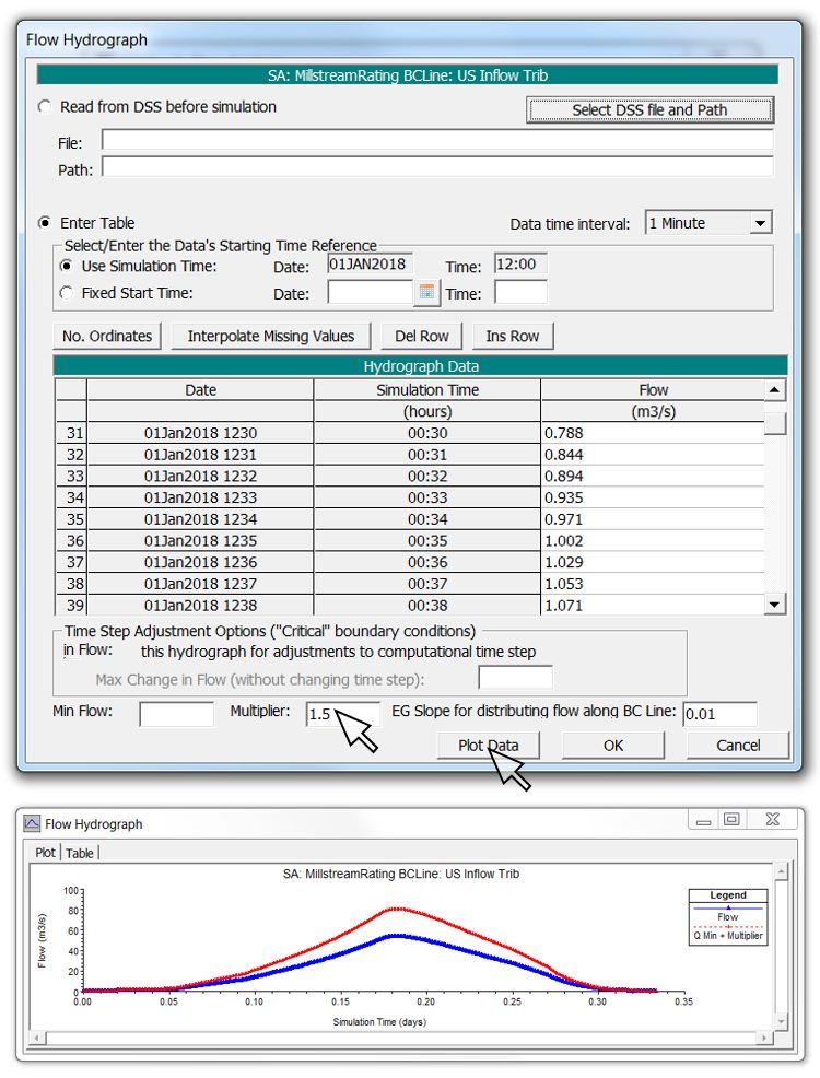
On the high end, we need to account for attenuation in ensuring that the peak flow rate in our inflow hydrograph produces the highest river stage that we would wish to capture with our gauge. You may want to take an event that you’ve already modelled and ramp up the flow with a multiplier until it reaches the desired stage:
We also want to make sure that the boundary conditions located along the outer extent of the 2D Flow Area are sufficiently far from the selected gauge location so that adjustments of EG slopes within a reasonable range do not affect the water surface profiles and rating curves. This might require extending the 2D Flow Area.
Case Study
For this exercise, I’ll take a 2D model from one of our earlier tutorial workshops that has already been set up and run. You can follow along with these steps to generate rating curves using any working model.
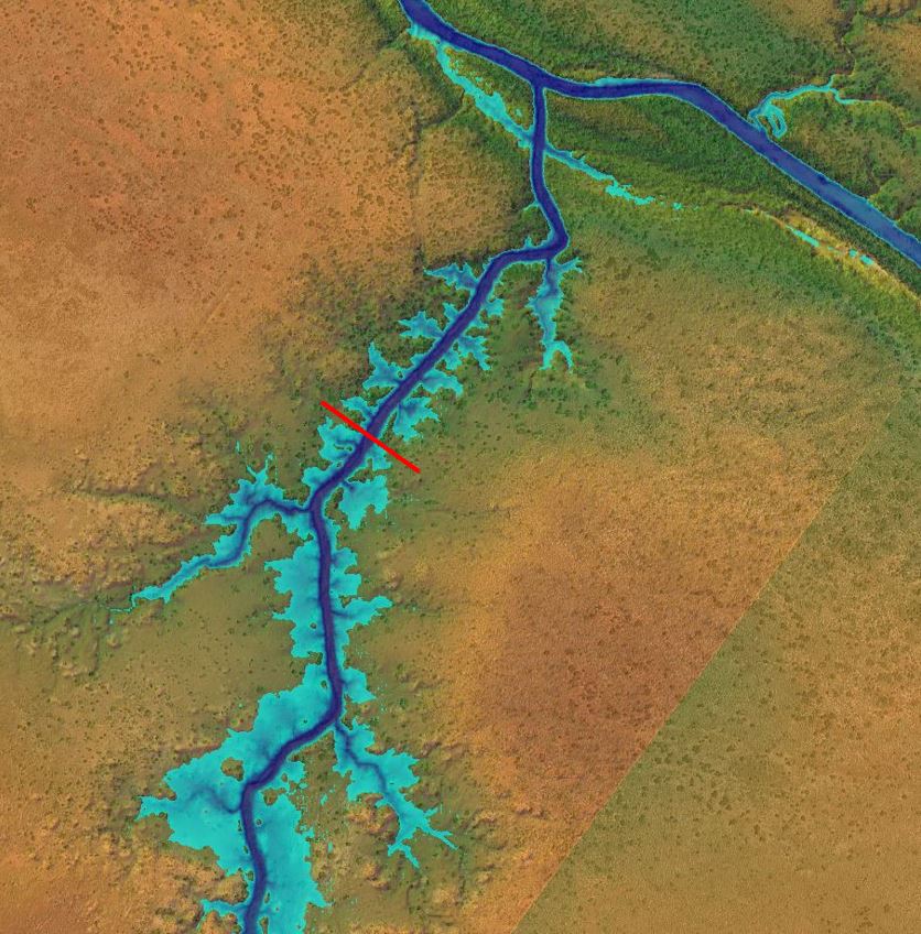
A straight, confined, uniform channel would essentially give us the same rating curve in 1D or 2D – or even just with Mannings equation for that matter – so to make things a little more interesting (and to demonstrate looping effects), I’ll choose a model of the Fortescue River in Western Australia. Specifically, I’ll zoom in on a reach with a tributary that has a bit of sinuosity, some backwater effects, and a significant amount of tributary and floodplain storage.
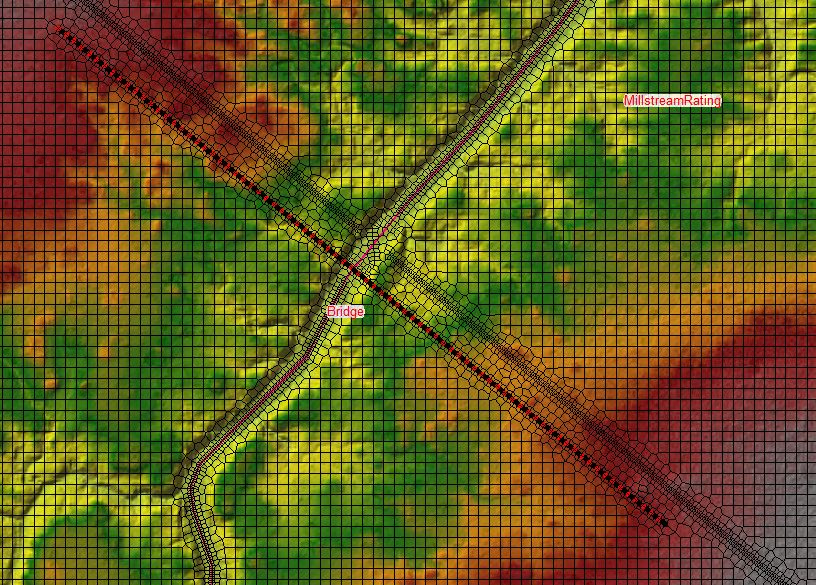
A proposed location for a gauging station is shown by the red line in the RAS Mapper view below:
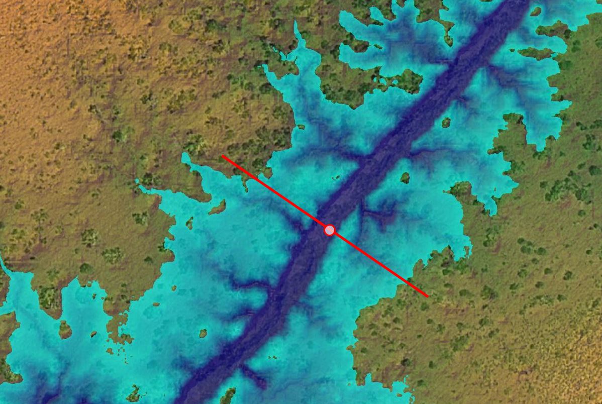
The gauge location was selected to be in a relatively straight reach of the tributary away from the confluence area, which should give us a fairly straight-forward rating curve for our first example. The gauge is assumed to be a pressure transducer or similar device that would record the flow depth at specified time intervals, which can then be converted to water surface elevations using the surveyed datum. The idea behind a rating curve is that any recorded river stage can then be converted to an estimated discharge using the derived and/or measured stage-discharge relationship.
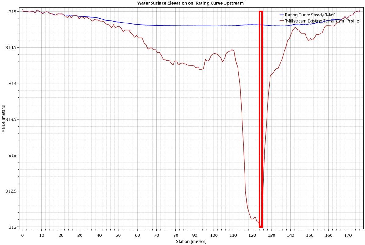
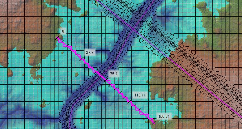
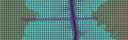
Here is a zoomed-in plan view and cross section of the proposed gauge location. The cross section for measuring flow is aligned perpendicularly to the flow direction. The section line passes through the gauge, which is located along the channel thalweg.
Extracting a Rating Curve from SA/2D Area Connection Line in the Geometry Editor
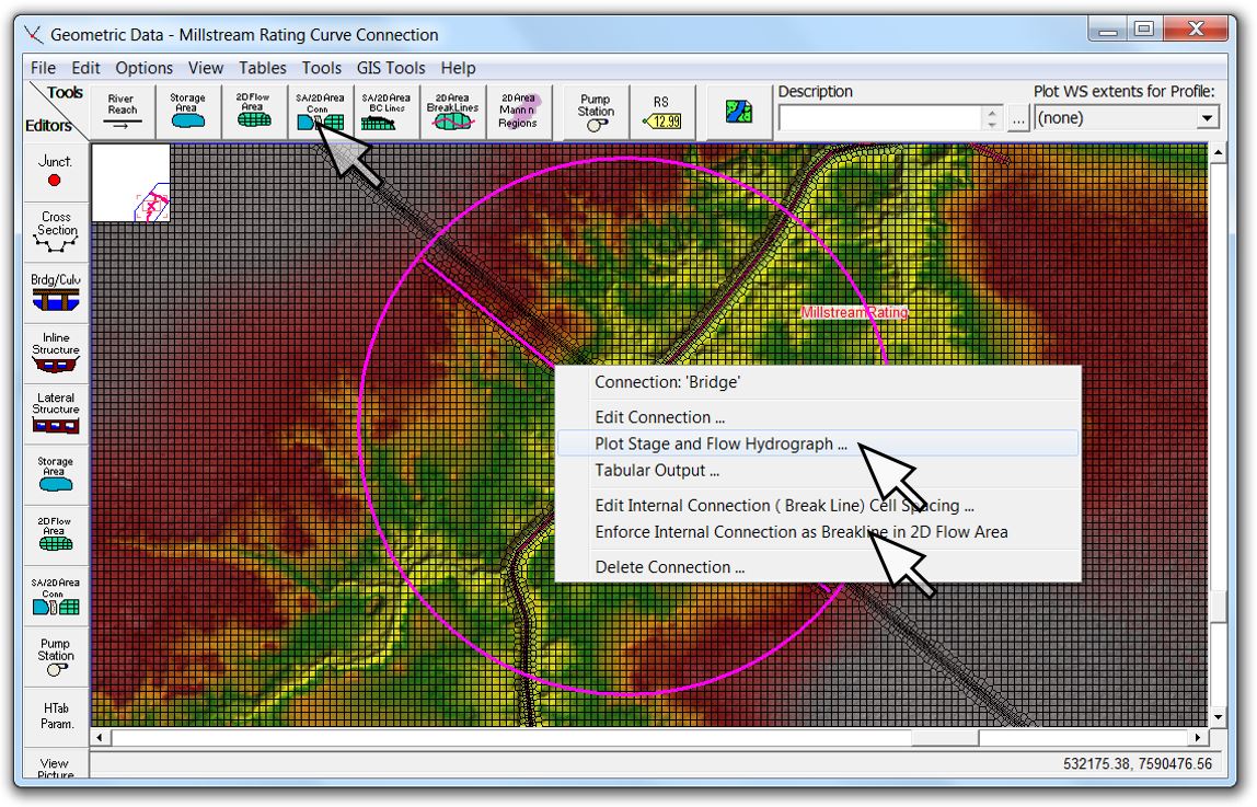
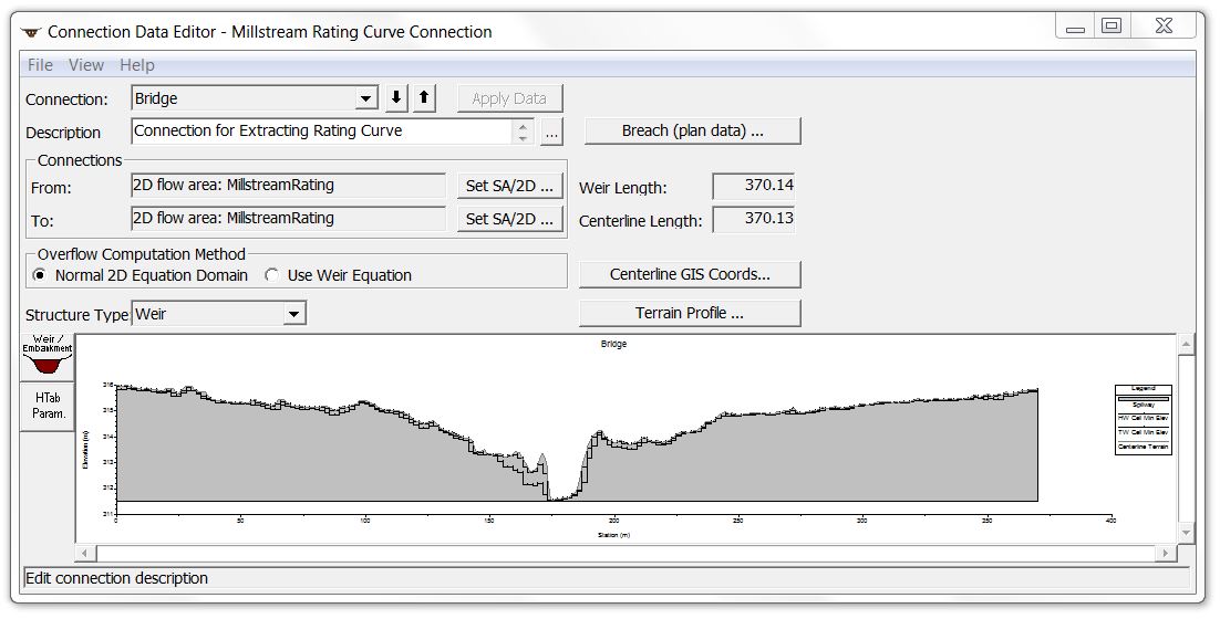
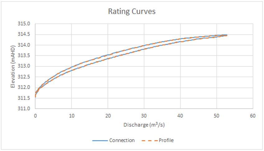
A connection line is one of the simplest ways to generate a rating curve from a 2D model. To do this, you would delineate a SA/2D Area Connection as shown below, and enforce the connection as a breakline. For this example I used the same profile line as above and copied and pasted the coordinates using GIS Tools, keeping the alignments identical for comparison. The next step is to edit the connection and copy the terrain profile over the weir/embankment station-elevation points. So long as you leave the method as normal 2D equation domain, you’ve just painted a line on the ground without any hydraulic effect.
You’ll need to run the plan to get rating curve data, and once you do so, you’ll essentially get the same options as in 1D. When you click on the connection line and select “Plot Stage and Flow Hydrograph” you’ll see windows shown below. The figures show each tab selected, followed by a comparison of the results using the two methods (connection vs. profile line). As you can see, the lines are right on top of each other, so the approach you take is really up to your own preference.
[If you have a very long cross section line, or very fine grids, you may not want to use the connection method because you will be limited to 500 points along your embankment.]
Extracting Rating Curve Data from RAS Mapper Profile Lines
There is an automated function for extracting rating curves in RAS Mapper (still called a “beta” function) but it averages the stage across a profile line which can generate erroneous results.
In order to generate a rating curve from a 2D HEC-RAS model, we’ll need to extract 1) a flow hydrograph along a profile line and 2) a stage hydrograph at a point as time series data using RAS Mapper.
[The differences between extracting rating curves from 1D vs. 2D models are covered in Part 2.]
1) Flow Hydrograph
To extract a flow hydrograph from a 2D model, we’ll need to choose an alignment for the section across which flow rates will be measured. Keep in mind that a 2D model can only extract flow data across a cell face, so even if I draw a straight line for my cross section, the computations will snap to the nearest computational cell faces. In order to ensure that we are measuring flow across the actual line that we have selected, we will need to enforce the cross section as a breakline. This screen shot shows the cell faces that will be used to extract time series data for enforced and un-enforced cross section lines:
It is preferable to have the section alignment saved as a shape file. In the case of a rating curve, having the cross section defined as a shape file allows you to use the same line as both a break line for mesh generation (in the Geometric Data Editor) and as a profile line for flow measurement (in RAS Mapper).
[By the way, I always recommend defining any geospatial data for HEC-RAS, including profile lines, break lines, structure alignments, etc. in CAD or GIS applications outside of HEC-RAS so that all features can readily be converted to shape files for importing into HEC-RAS. That way they’ll be recoverable with identical coordinates in other HEC-RAS projects or in any other hydraulic model (rather than just being based on approximate mouse clicks). This also allows features to be viewable in both RAS Mapper and the Geometric Data Editor and can provide consistent comparisons for benchmarking results. Having the features defined elsewhere can also help with recovery of input data – remember, there’s no undo command in HEC-RAS if you accidentally delete or change something!]
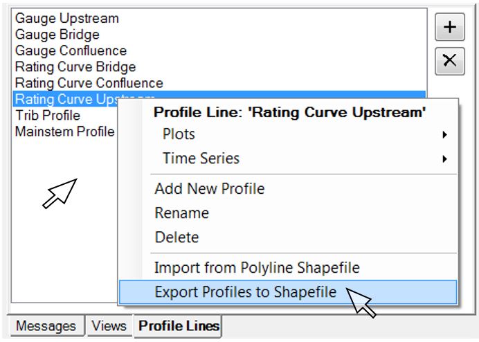
If you already have the cross section alignment as a shape file, you would click on the “Profile Lines” tab in RAS Mapper, then right-click anywhere in the window and select “Import from Polyline Shapefile.”
If you don’t have the data as a shape file to begin with, you can use RAS Mapper to create a shape file. Start by drawing the profile lines (using the “Plus” button to delineate each feature and then assigning each one a unique name). Save the profiles to a shape file by right-clicking in the profile menu and selecting “Export Profiles to Shapefile”. If you haven’t done so already, I recommend creating a separate GIS subfolder for storing shape files when it prompts you for the path.
[Remember that regardless of which profile line is highlighted or where you click in the window, all profile lines will be saved as separate features in a single shape file with a name field that includes the assigned profile line names.]
With the profiles converted to shape files, you can then add them to RAS Mapper as a layer by right-clicking on “Map Layers”, selecting “Add map data layers”, and choosing the shape file you just created. Once they have been added as layers in RAS Mapper, you can edit their appearance and then go into the Geometric Data Editor and turn on the shape file by selecting the map icon.
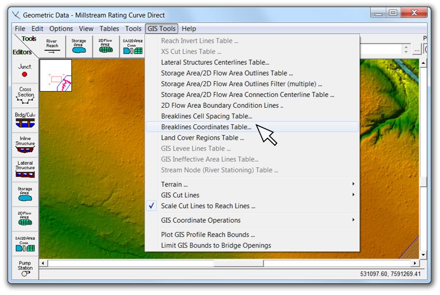
To convert the profile lines to breaklines in the Geometric Data Editor, click on “GIS Tools | Breaklines Coordinates Table”:
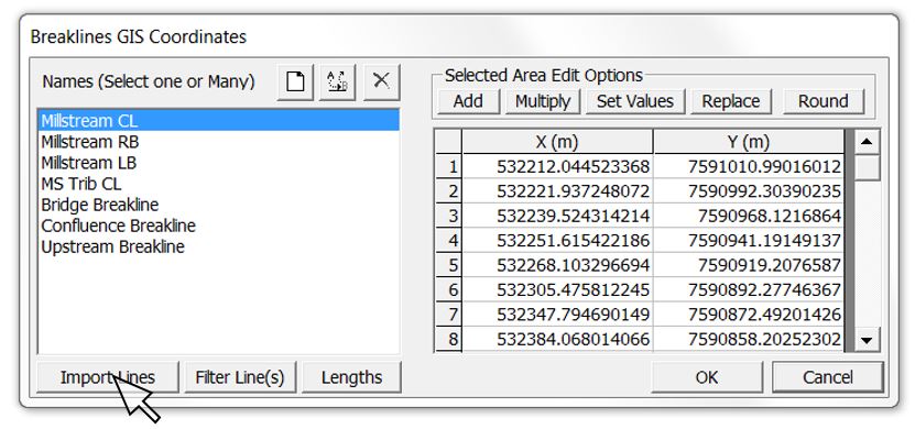
A table showing the coordinates of each existing breakline will appear. Click on “Import Lines” and select the shape file that contains the profile lines:
When you click “OK” you should see your features appear as breaklines. Note that all of my profile lines are now separate breaklines. You may wish to rename them, and then you can click on each one (or use “GIS Tools | Breakline Cell Spacing Table) and enter the desired cell spacing. I try to use the resolution of the underlying terrain as my minimum breakline cell spacing in order to capture all available topographic data across the section alignment. [Leave off the maximum if you want HEC-RAS to interpolate a range of cell sizes out to your uniform mesh resolution.]
Enforcing the breakline ensures that cell faces will be oriented along the cross section alignment. Here’s an example showing both the cross section and the low flow channel enforced as breaklines:
You’ll probably want to have your low flow channel, top and toe of bank, roadway crests, and other features defined as breaklines as well. The ability of HEC-RAS to account for subgrid terrain resolution may allow you to get reasonable results from channels that are only one or two grid cells wide; however, it’s good practice to put in enough breaklines to define your channel with at least eight or ten computational grids across the section – and preferably more. Some of the breaklines that follow the channel alignment may cross your section line as in the example above. Cell errors will tend to appear at the intersections in particular; try to fix any “red dot” errors by adjusting minimum/maximum cell spacing values, moving/adding breaklines, or “breaking” the breaklines to avoid crossing each other.
[It’s probably good practice to fix errors using breaklines rather than adding/moving/removing individual computational points, since in the latter case you would have to redo the edits manually every time you recompute your overall mesh.]
At this point you can re-run the plan and check the results. If your gauge location is already fixed, you may not have the option of making any changes to it, but if you are using your model to help select a gauging location, you may wish to animate both the plan and profile view to ensure that the proposed gauge is located in an area with relatively uniform flow conditions and that the duration of the hydrograph allows stable conditions during the rising and falling limbs of the hydrograph. [A discussion of hydrograph durations for pseudo-steady and unsteady flows is covered in Part 2.]
Once your inflow hydrograph and gauge location are finalised, you can revisit the orientation of your cross section by viewing the results in RAS Mapper and checking your flow directions (using velocity vectors or particle tracing) to ensure that the proposed cross section is aligned perpendicularly to the flow direction and extends beyond the inundated area. [If the ends of your cross section line are submerged, your hydrographs will be missing part of the flow.]
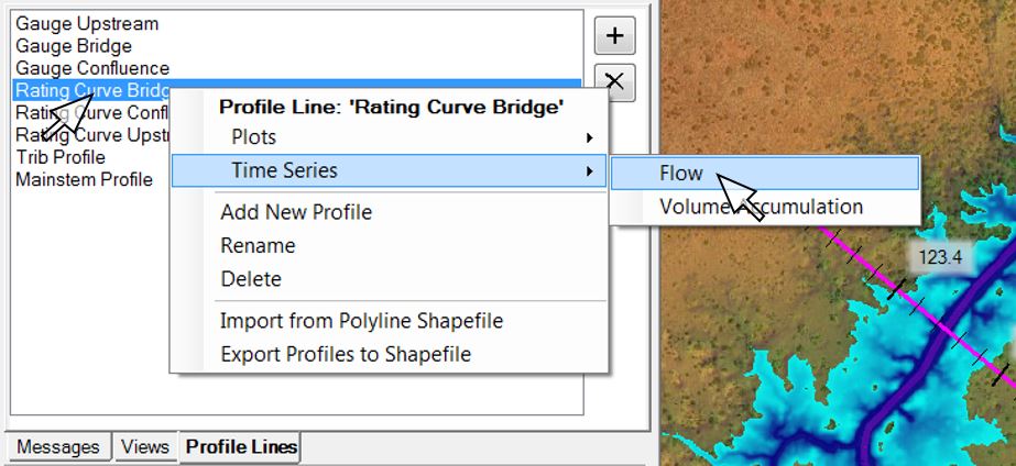
These processes can be a bit iterative, but it’s best to get it right to begin with. Once we’re happy with the section location and alignment, we can extract a flow hydrograph as a time series by right-clicking on the appropriate profile line and selecting “Time Series | Flow”:
Before we start talking about exporting the flow data, let’s cover the development of the stage hydrograph; then we can export both data sets together for use in our rating curve.
2) Stage Hydrograph
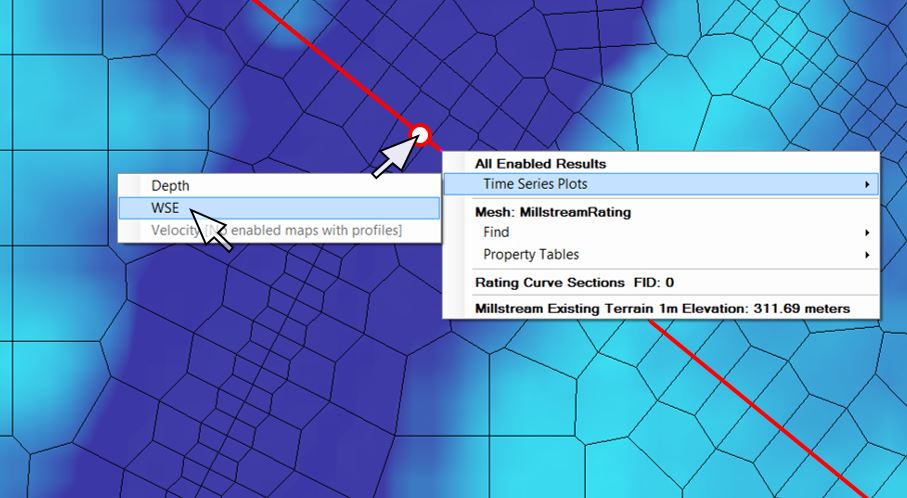
We’ll take a similar approach as outlined above to generate the results that we’ll use to extract the stage hydrograph. To measure stage, we’ll need to zoom in on the actual gauge location, then right-click and select “Time Series Plots | WSE”:
[This method relies on the position of your cursor to extract the stage data. Keep in mind that the Render Mode will affect the water surface elevations that are extracted at your specified point – if your mesh is sufficiently fine, the differences should be minimal, but you can adjust the render mode (under “Tools | Render Mode Options”) to check.
Because we have enforced our cross section line as a breakline, by default there will be a cell face that crosses right through the gauge. If you select “Horizontal” as the Render Mode Option and “WSE” as the active layer, hovering over the cells as you move the cursor to either side of the line will display the difference between stage levels at the computational points in the adjacent cells. Be sure to check time steps during the rising and falling limbs rather than just the max values.
If you’re dealing with an existing gauge and want to be more exact in terms of the location, you could edit the 2D Flow Area in the Geometric Data Editor, then click the button labelled “View/Edit Computation Points” and add a computation point for the actual surveyed coordinates of the gauge. Then with “Horizontal” as the Render Mode, anywhere you click within the cell will generate the water surface elevation time series that has been computed right at the gauge location.
Selecting “Sloping” as the Render Mode will give you an interpolated value between the two nearest computational points, and the water surface elevations shouldn’t vary as much with minor changes in the position of the cursor. For our purposes here I would recommend the “Sloping” Render Mode.
Combining Flow and Stage in a Rating Curve
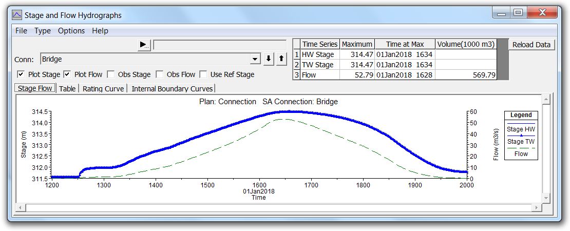
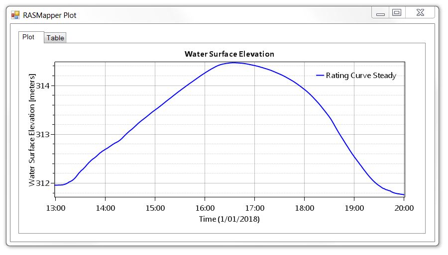
Both the flow hydrograph and the stage hydrograph will generate a plot in RAS Mapper with time on the horizontal axis.
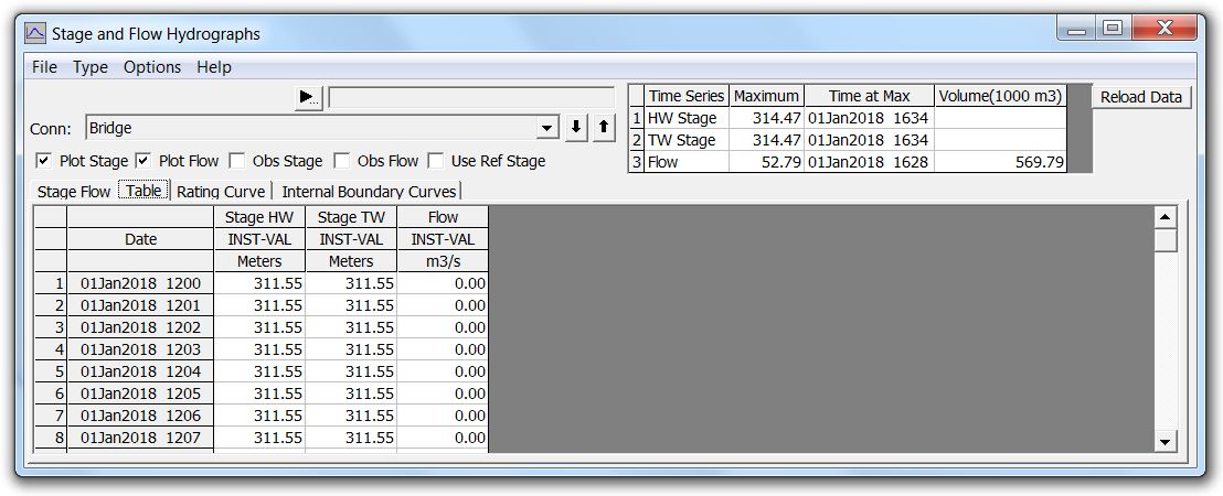
Click on the “Table” tab for each of these windows, then click in the upper left cell of the table to select all. Copy the selected values to the clipboard and paste into Excel or other spreadsheet/graphing program.
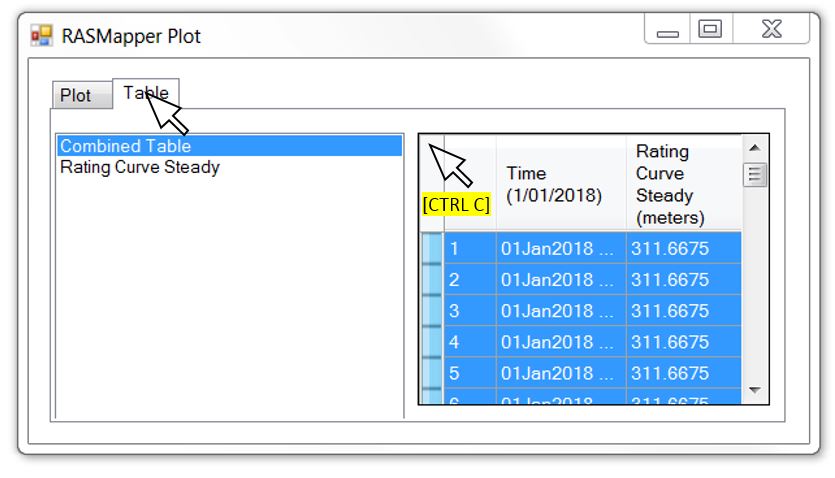
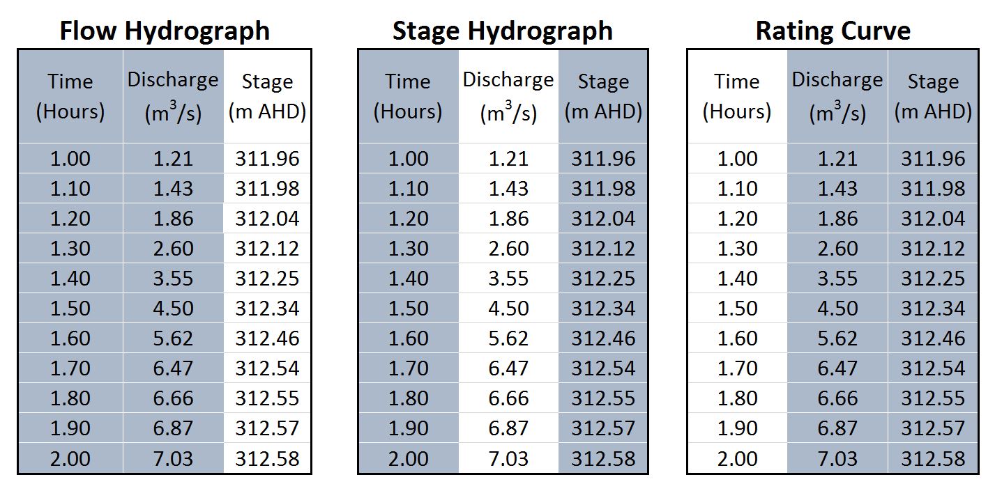
The time steps should be the same for both tables, so once we have the results in Excel, we can delete the duplicate data and just leave three columns (Time, Discharge, and Stage).
[Keep in mind if you click on a single column in the RAS Mapper table to try to select it, the results will be sorted by the values in that column, which can give you a completely erroneous hydrograph when you paste it into Excel!]
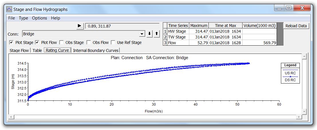
In order to generate a rating curve for our gauge, we’ll need to remove the time axis by plotting stage against flow. The highlighted columns below show the tabulated data ranges that you would plot to produce flow hydrographs, stage hydrographs, and rating curves:
We can plot flow hydrographs and stage hydrographs separately or merge them together on the same plot using a secondary vertical axis as shown below. I’ve shown the combined hydrograph with flow on the left and stage on the right, but the primary and secondary axes could very well be reversed. The default plots in HEC-RAS 1D, for example, have stage on the left and flow on the right. In either case, when we remove the time component and plot flow against stage, we’ll get our rating curve: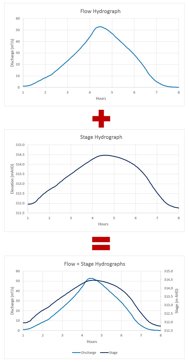
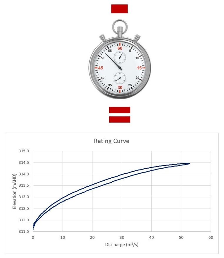
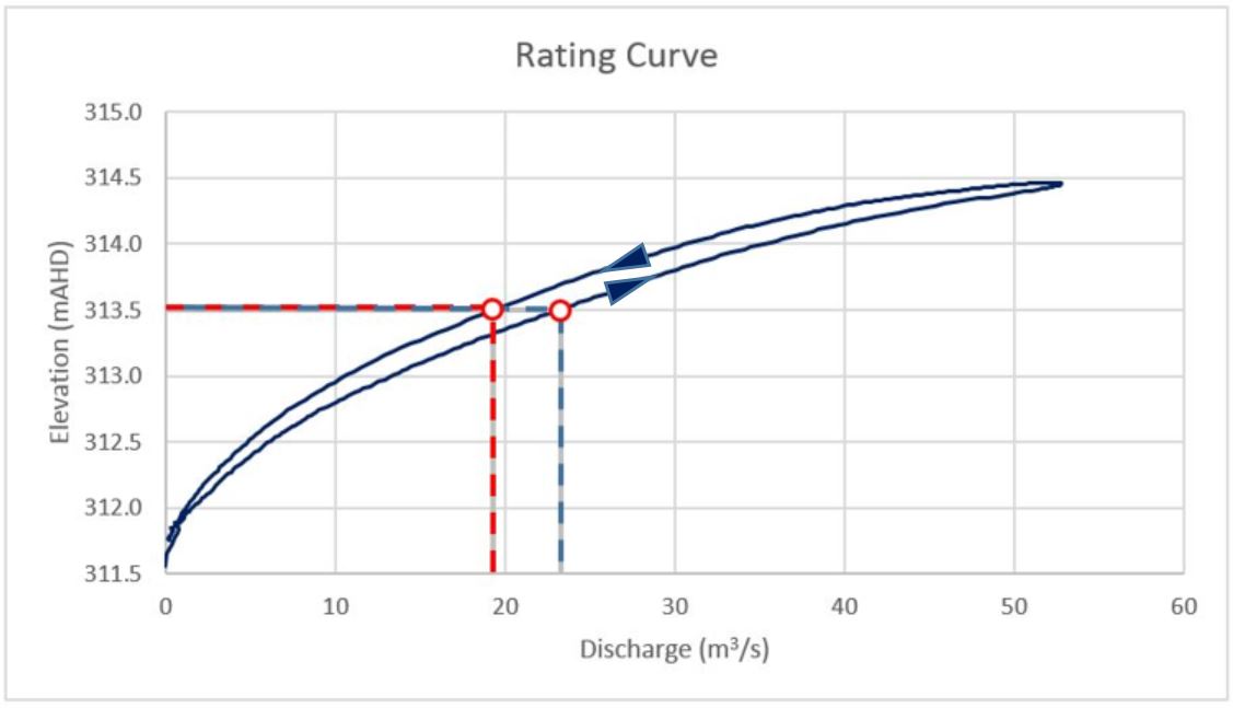
Reading a looped rating curve
The rating curve we developed above exhibited a looping effect; in other words, it followed a different path on the way up than it did on the way down. Rating curves based on unsteady flow conditions are almost always looped to some degree.
[A discussion of steady vs. unsteady flow rating curves is presented in Part 2.]
A looped rating curve like the one we’ve generated above just means that when the water surface elevation reaches a given stage during the rising limb of the hydrograph, it will correspond to a different flow rate than when the same stage is reached on the falling limb. Typically the rising limb yields a higher flow rate; storage and backwater effects during the falling limb tend to be stronger, reducing the corresponding flow rate for the same elevation. Here is an illustration of how to read the rating curve using the same hydrographs as presented above: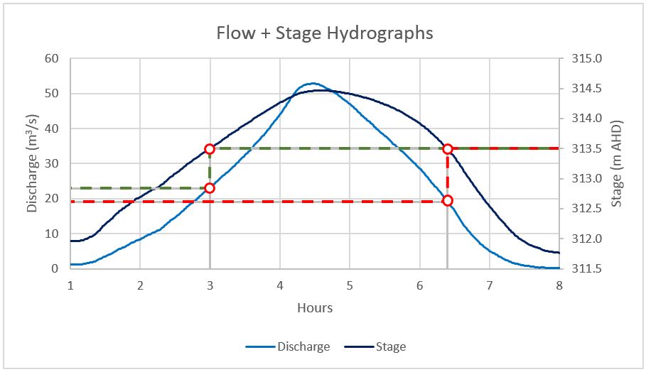
In this case, the hydrographs show that a water surface elevation of 313.5 metres was reached twice: once at time 3.0 hours on the rising limb, and again at approximately 6.4 hours on the falling limb. If we follow the green dashed line on the hydrograph to the flow rate that corresponds to a stage of 313.5 metres on the rising limb, we get approximately 23 m3/s. If we follow the red dashed line to the flow rate that corresponds to a stage of 313.5 metres on the falling limb, we get approximately 19 m3/s. The corresponding points are also shown on the rating curve.
That’s it?
So there you have it: If you followed along, you have now generated a simple rating curve using 2D hydraulics! Stop here if that’s all you were looking for…but…if you want to get geeked out on some additional exercises, let’s have a look at the underlying assumptions, our confidence limits, and what factors might skew our results. A good model always includes some iterations: you run it, check the results, tweak the input, rinse, and repeat. So let’s put it through the works in Part 4!
Read the rest of our articles about rating curves:
- Rating Curves Part 1: Webinar recording and background resources
- Rating Curves Part 2: What is a rating curve?
- Rating Curves Part 3: Extracting flow and stage results from a 2D model
- Rating Curves Part 4: Sensitivity analyses